
2024
Marukawa
Packaging & Branding
3 - 4 Weeks
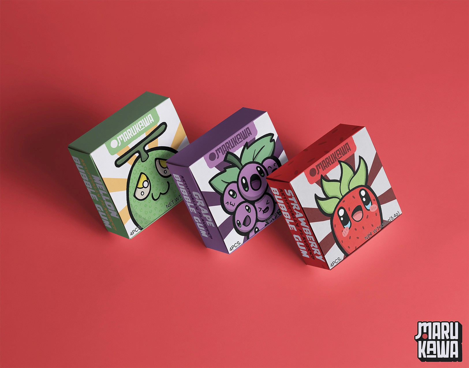
As a kid, my favorite bubblegum wasn’t Juicy Fruit, Hubba Bubba, or Bubble Yum. It was Marukawa’s tiny 4-piece spheres of joy. Even back then I remember thinking, “This looks like bubblegum for adults who are ashamed of chewing bubblegum.” The packaging? A bland betrayal of the nostalgic magic it deserved. But now that I’m out here pretending to be a functioning graphic designer, I finally have the power to right that wrong.
knew I had to start with the logo—something bold, playful, and worthy of a candy brand. “Marukawa” translates to “Circle River,” and in one of those rare cosmic design moments, the kanji for “river” already kind of looks like a Latin M. Connecting those strokes gave me the bones of the logo.

And in the spirit of heavily paraphrasing Dieter Rams: “Good design is lazy.” So for Maru (circle)? I slapped a circle on it. Done.